Page 8
A little inspiration makes the Pendulum swing back
I said on page one of this section (and have typed elsewhere on this web site more than a few times) that the sketching pendulum swings back and forth. There was a gap of six months between the previous page of the Moleskine project and this one. A visit to a special Hokusai exhibit at Ueno Museum (on loan from the Boston Museum) inspired me to take up my pencil and brush again.
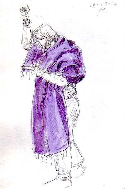
I was also inspired by some kiri-e or Japanese "paper cut art" I had seen, with its bold black lines and bright colors.
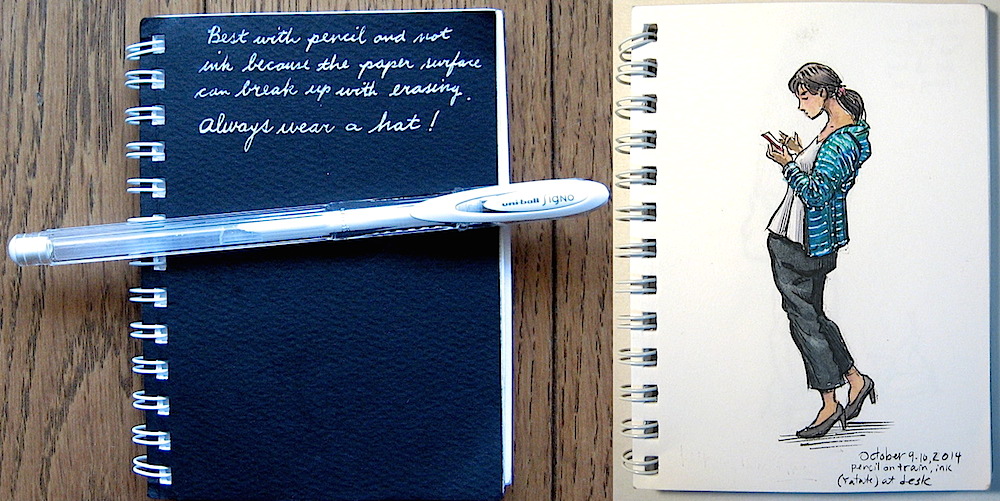
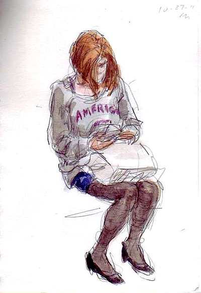
I had been slowly collecting sketches in pencil and watercolor all along in my spiral bound pocket sketchbook (a.k.a. "butterfly net"), and quickened my pace so I could have enough to fill a new page in my "people collection" Moleskine project. This time I tried to keep my lines heavy and deliberate like kiri-e.
I also tried to make the colors a little bolder and more fun.
Using white paint on watercolors?
The Hokusai exhibition had some paintings done by Hokusai's daughter Oe (or Oei). I noticed she used opaque white or gold paint to depict details of print on fabric which is so common on Japanese clothing.
I had learned many years ago many watercolorists never use white paint, and I have stayed away from it as well. But I thought I'd try it and see what happened. I didn't have any white watercolor paint so I used my white gel pen which I keep for writing notes to myself on sketchbook covers.
I had a sketch in my pocket sketchbook which I had already colored, but could stand a little excitement. So I added white stripes.
I liked the results and decided to go out and buy some white opaque paint and expand my palette. But I'm not accustomed to using white watercolor which apparently has to go on really thick or else it goes transparent when it dries. I think that gel pen does the best most reliable job, so I'll keep it close at hand!
My gel pen is a Uni-ball Signo Angelic . I had tried a few others but this turned out to be the best. . I had tried a few others but this turned out to be the best.
The next sketch in my collection, pages 38 and 39, just happened to include a girl in a blue dress with white dots, and another girl with white accents on the edge of her skirt. I would normally ignore these details because they are too difficult to paint around, but this time that gel pen made a big difference.
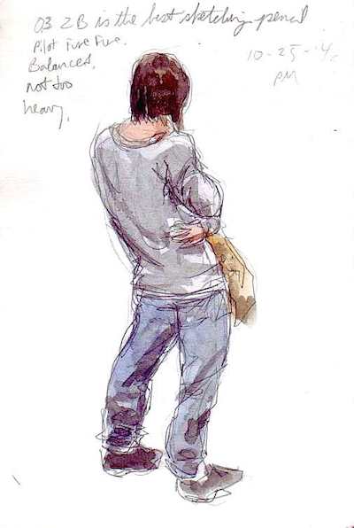
Normally, I prefer standing figures because they have so much more energy than sitting figures. The big problem is that most people standing on the train are constantly changing their pose -- every few seconds! Sitting people don't move, especially if they are sleeping. So if I can find an interesting sitting pose, it's like finding treasure.
Also, I try to balance my sketches by including both males and females, but I'm naturally attracted to beauty, and prefer drawing pleasant looking subjects. It has become apparent that most women in Japan make an effort to look graceful and attractive while most guys don't seem to care about their appearance at all, and many are downright repulsive. So forgive me if there are more women than men in my sketches.
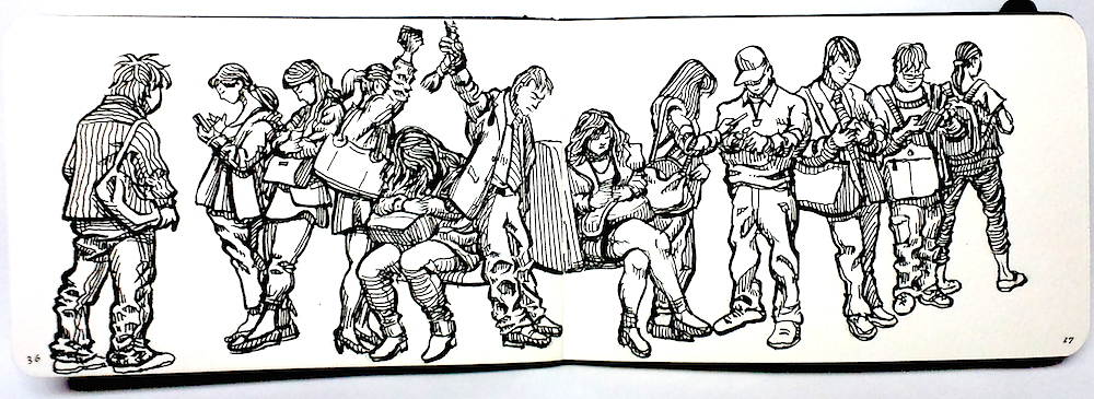
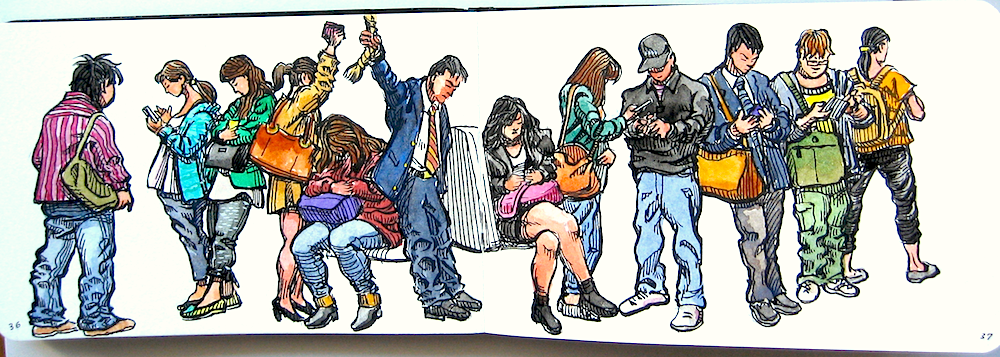
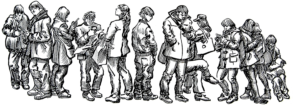
Giving in to black and white
When I compared the color version with the black and white version of the sketch at the top of this page, I felt I should have refrained from adding color. I've had this feeling many times with other sketches in the past, but I love color, and find it exciting -- as most people do. But I know that adding color to an ink drawing can obscure the white space between the hatch lines and take away the sparkle.
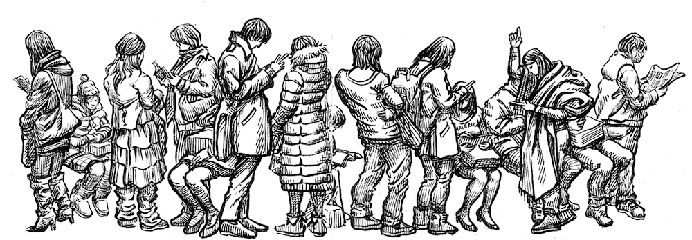
So on the next two-page spread I decided beforehand that I would refrain from adding color. With this in mind, I went ahead and defined the light and shadow with hatching only, and added more lines than I normally would.
As always, I started with the figures in the center. I used my Kuretake Brush Pen with Platinum Carbon Ink, with Platinum Carbon Ink, for outlines and the Platinum Carbon Pen for outlines and the Platinum Carbon Pen for hatching. But by the time I got to the four females on the left and the guy reading the newspaper on the right, I had put the Carbon Pen away and was rendering both outlines and hatching with the brush only. The hatch lines have subtle width variation which comes from a brush. for hatching. But by the time I got to the four females on the left and the guy reading the newspaper on the right, I had put the Carbon Pen away and was rendering both outlines and hatching with the brush only. The hatch lines have subtle width variation which comes from a brush.
I was very happy with the results. I think that my ability in ink drawing is better than my coloring ability, and I might be better off avoiding color altogether, at least in the final art.
All of these poses were selected from the quick pencil and watercolor sketches done entirely on-the-spot in the train in my cheap spiral bound pocket sketchbooks (a.k.a. my "butterfly net"). Here are just a few of those butterflies:
You can also see all my spiral bound "butterfly net" sketches on one page in one big collection.
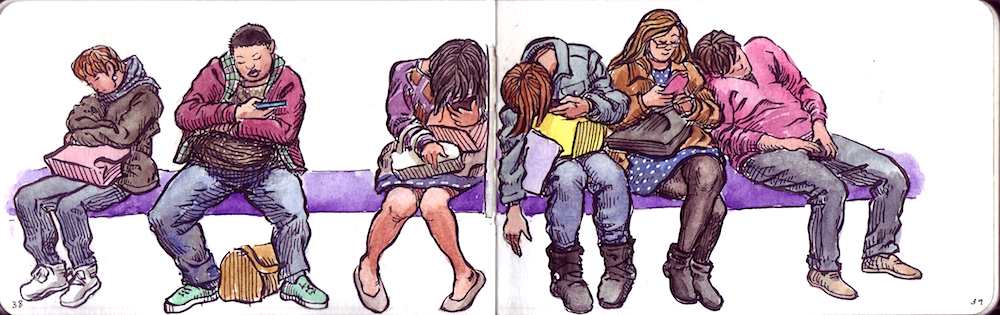
I decided to stay with black and white ink sketching and went on to produce this next two-page spread, again using rough pencil sketches from my train commute. I used my Kuretake brush pen with Carbon Ink for the most part, switching to my Carbon Ink fountain pen for some hatching.
I'm pretty happy with this new focus on brush and ink, and since I only have a few more pages in this Moleskine, I think I will shelf it and take this idea of sketching only in ink to the next level and draw a little bigger. I've ordered a new Stillman & Birn Epsilon 6 in. x 8 in. wire bound sketchbook  which is the best paper for ink drawings, and just the right size to fit in my bag so I can keep it with me. This should be exciting... which is the best paper for ink drawings, and just the right size to fit in my bag so I can keep it with me. This should be exciting...
|